2027 Interior Color Trends: Earth Tones, Biophilic Palettes, and Bold Accents
Explore the interior color trends expected to define 2027 — from warm earth tones and biophilic greens to confident accent walls. Includes RAL code suggestions for each trend.
2027 Interior Color Trends: What to Expect and How to Apply Them
As we move through 2026, design studios and material fairs are already mapping out what will shape interior spaces in the year ahead. Based on signals from leading design weeks, paint brand forecasts, and shifts in architectural discourse, 2027 is shaping up to be a year defined by grounded, nature-rooted palettes alongside selective use of bold, confident hues. This guide breaks down each major trend, recommends specific RAL codes, and explains how to apply them room by room.
1. Warm Earth Tones: The Continued Rise of Organic Interiors
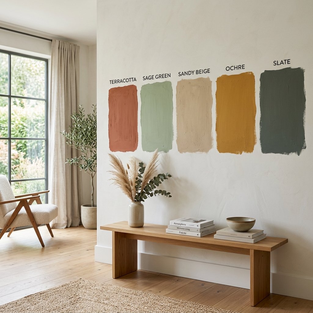
Earth tones are expected to remain dominant in 2027, but with a shift away from the dusty neutrals of recent years toward warmer, more saturated expressions. Think sun-baked clay, terracotta, warm sand, and deep ochre — colors that evoke natural minerals and raw materials.
These tones work particularly well in living rooms and dining areas, where warmth and intimacy are priorities. On walls, a single earth-toned surface paired with natural wood furniture and linen textiles creates a cohesive, tactile environment.
Recommended RAL codes for this trend:
| Color Name | RAL Code | Best Application | |---|---|---| | Terracotta Red | RAL 3012 | Accent wall in living room | | Loess Yellow | RAL 1002 | Full-room treatment in dining area | | Beige Brown | RAL 8024 | Kitchen cabinetry or joinery | | Pale Brown | RAL 8025 | Bedroom walls, warm base tone | | Reed Beige | RAL 1019 | Hallways, transitional spaces |
When working with these tones, avoid pairing them with cool greys — this combination creates visual tension. Instead, combine with off-whites (RAL 9001 or RAL 9010) or deep warm browns to maintain harmony.
2. Biophilic Palettes: Bringing the Outside In
Biophilic design — the practice of connecting interior spaces to the natural world — is expected to be one of the defining architectural philosophies of 2027. In color terms, this translates to a range of greens from muted sage to deep moss, alongside stone greys, bark browns, and sky blues.
The logic is straightforward: humans respond positively to colors associated with living systems. Incorporating these tones reduces visual fatigue, which is especially valuable in home offices and bedrooms.
Recommended RAL codes for biophilic palettes:
| Color Name | RAL Code | Best Application | |---|---|---| | Reed Green | RAL 6013 | Bedroom, meditation room | | Fern Green | RAL 6025 | Living room feature wall | | Slate Grey | RAL 7015 | Bathroom walls, stone reference | | Olive Drab | RAL 6014 | Study, library | | Patina Green | RAL 6000 | Kitchen splashback or cabinetry |
For biophilic schemes, texture matters as much as color. Pairing RAL 6013 on walls with natural stone flooring and indoor plants reinforces the sensory connection to nature.
3. Deep, Saturated Blues: Confidence in Compact Spaces
While naturalistic tones dominate the broad palette, 2027 is also expected to see a confident return of deep blue in residential interiors. Not the muted navy of previous seasons, but rich, enveloping blues that anchor a room.
Deep blues are particularly effective in studies, reading rooms, and bedrooms — spaces where a sense of enclosure and focus is desirable. When used on all four walls (rather than as a single accent), they create an immersive quality that homeowners and designers are increasingly drawn to.
Recommended RAL codes for deep blues:
| Color Name | RAL Code | Best Application | |---|---|---| | Sapphire Blue | RAL 5003 | Study or bedroom, all walls | | Steel Blue | RAL 5011 | Living room feature wall | | Pigeon Blue | RAL 5014 | Children's room or nursery | | Cobalt Blue | RAL 5013 | Bathroom, paired with brass fixtures |
Trim and joinery in RAL 9002 (Grey White) or RAL 9010 (Pure White) provide essential contrast and prevent deep blues from feeling oppressive.
4. Warm Whites and Limewash Finishes
Not every trend is about color saturation. In 2027, warm whites and limewash-inspired finishes are expected to define a significant share of interiors — particularly in spaces influenced by Mediterranean and Scandinavian aesthetics.
The key distinction from clinical white is warmth. RAL 9001 (Cream White), RAL 9010 (Pure White), and RAL 1013 (Oyster White) carry subtle undertones that make spaces feel livable rather than sterile.
Limewash finishes — which create a soft, mottled texture reminiscent of aged plaster — are increasingly being replicated with standard paint on smooth walls. Applied over RAL 9001 or RAL 1015 (Light Ivory), they produce a finish that photographs beautifully and feels authentic in person.
Where to use warm whites:
- Open-plan living and kitchen areas where continuity matters
- Bedrooms where a calm, restorative atmosphere is the goal
- Hallways and corridors that benefit from light reflection
- Spaces with strong natural light where richer colors would overpower
5. Terracotta Accents and Earthy Reds as Bold Statements
For those who want to move beyond neutral palettes without committing to full-room saturation, terracotta and earthy red accents are expected to be among the most popular choices in 2027. A single accent wall, a painted door frame, or a set of built-in shelves in RAL 3012 (Beige Red) or RAL 3017 (Rose) can transform the character of a room.
This approach works well in open-plan spaces where a color accent marks a functional zone — a reading corner, a dining area within a larger room, or a kitchen island.
How to Find 2027 Trend Colors in Your Inspiration Images
Predicting which specific shade is right for your space goes beyond knowing a trend exists. The practical challenge is identifying the exact color from a photograph — whether it is a designer's portfolio image, a social media post, or a photo you took of a space you admired.
WhtColor makes this process precise. Upload any inspiration image to whtcolor.com and the tool extracts the dominant and secondary colors, returning HEX, RGB, and RAL codes instantly. This means you can go from a saved photo to a supplier-ready RAL specification in seconds, without guesswork.
This is particularly useful when working with trend-forward palettes: instead of describing "a warm earthy terracotta" to a paint supplier, you arrive with RAL 3012 confirmed.
Summary: 2027 Color Directions at a Glance
| Trend | Key Tones | Representative RAL | |---|---|---| | Warm Earth Tones | Clay, ochre, terracotta | RAL 3012, RAL 1002, RAL 8024 | | Biophilic Palettes | Sage, moss, stone | RAL 6013, RAL 6025, RAL 7015 | | Deep Blues | Sapphire, cobalt, steel | RAL 5003, RAL 5011, RAL 5013 | | Warm Whites | Cream, oyster, ivory | RAL 9001, RAL 1013, RAL 1015 | | Earthy Red Accents | Terracotta, rose, brick | RAL 3012, RAL 3017, RAL 8004 |
The common thread running through each of these directions is a preference for colors grounded in the natural world — tones that have organic references and feel comfortable to live with over time. 2027 interiors are expected to move away from the stark contrasts of the previous decade toward environments that feel considered, layered, and genuinely livable.
Identify Your 2027 Trend Colors Instantly
Upload any inspiration image to WhtColor and get the exact HEX, RGB, and RAL codes in seconds — no more guessing at paint counters.
Find Your RAL Code