How to Find a Paint Color from Pinterest? Step-by-Step Guide
Spotted a wall color on Pinterest and want it in your home? Here's how to extract the exact HEX and RAL code from any image — 3 methods compared.
How to Find a Paint Color from Pinterest? Step-by-Step Guide
You're scrolling through Pinterest and there it is — that perfect wall color in a beautiful living room photo. You want it in your home. But there is one problem: what color is it exactly?
You cannot walk into a paint store and say "the color from that Pinterest photo." You need a HEX code, an RGB value, or ideally a RAL code that any paint supplier can work with.
In this guide, you will learn exactly how to extract the precise color code from any Pinterest image — or any image at all. Three methods compared, plus practical tips.
Why Is It So Hard to Find the Exact Color from Pinterest?
Pinterest is an incredible source of interior inspiration. Millions of room photos, color palettes, and decoration ideas — but one thing is always missing: there is no color code on the image.
The Common Problems:
1. "I want something like this blue"
- The paint store shows you 50 shades of blue
- None are quite right
- You end up buying the wrong color
2. "I'll show them on my phone"
- Every screen displays colors differently
- The salesperson says "maybe this one?"
- Risk: you regret it after the walls are painted
3. "I'll search for something similar on Google"
- Hours of searching
- Still no exact match
The solution: Extract the precise color code from the image itself. Here is how:
Method 1: WhtColor (Recommended)
Time: 30 seconds Accuracy: 99% Cost: Free (5 images/month)
Step by Step:
1. Save the Pinterest Image
Find the image you love on Pinterest.
On Desktop:
- Click on the image
- Top right corner → three dots (...)
- "Download image"
- Saved to your computer
On Mobile:
- Open the image
- Top right → Share icon
- "Save image"
- Saved to your camera roll
Alternative — Screenshot:
- Windows:
Win + Shift + S - Mac:
Cmd + Shift + 4 - Mobile: Power + Volume Down
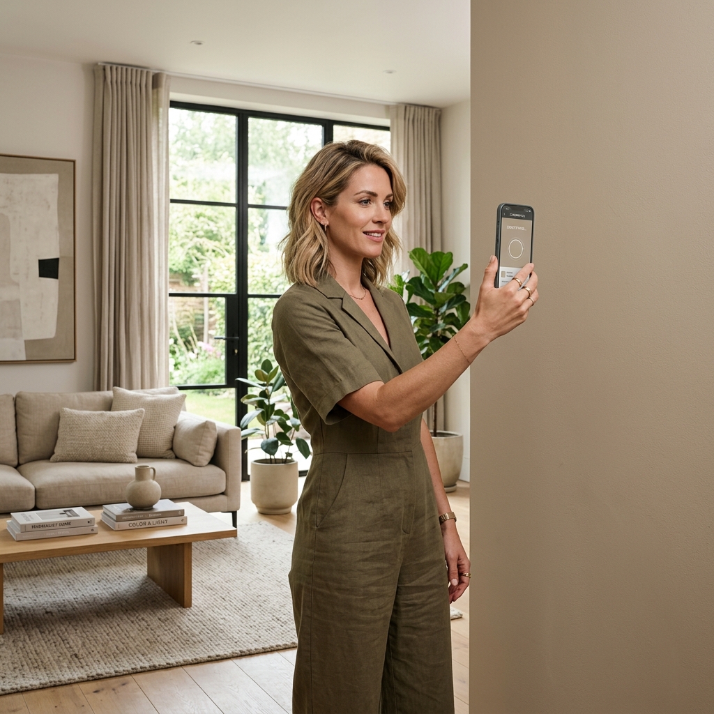
2. Upload to WhtColor
- Go to whtcolor.com
- Click "Upload Image"
- Select your Pinterest image
- The image loads in 2–3 seconds
3. Use the Eyedropper to Pick the Color
Once the image loads, you will see three modes available.
Use Eyedropper Mode.
- Activate eyedropper mode
- Move your cursor across the image
- Click exactly on the color you want
- Color selected
Tip: If you want the wall color, avoid the areas in direct light or deep shadow. Pick from a mid-tone section of the wall for the most accurate result.
4. Get Your Color Codes
The moment you click, all the codes appear:
HEX:  #6B8E9C
RGB:  rgb(107, 142, 156)
RAL:  RAL 5024 — Pastel Blue
That is it.
5. Head to the Paint Store
Now you have a real code to work with:
What to tell the supplier: "Hi, I'd like RAL 5024 in matte, 10 litres please."
or
"Hi, can you mix a paint to match this HEX code: #6B8E9C?"
Most modern paint stores (Jotun, Dulux, Farrow & Ball, or your local supplier) can work with both RAL and HEX codes.
Why WhtColor Works Best for This
- Fast: The entire process takes under 30 seconds
- Accurate: Uses the Delta-E color distance algorithm — the same standard used in professional color science
- Complete codes: HEX, RGB, and RAL (213-color database)
- Free tier: 5 images per month (enough for most home projects)
- Premium: Unlimited uploads + PDF export
Method 2: Google Lens
Time: 1–2 minutes Accuracy: Medium Cost: Free
Google Lens is a visual search tool. You can use it to identify colors, but it won't give you a precise code.
On Mobile (Android / iPhone):
- Open the Google Lens app (also available inside Google Photos)
- Load your Pinterest image from your gallery
- Tap on the area of color you want to identify
- Tap "Search"
Google Lens will show you visually similar images — but it will not give you a HEX or RAL code.
The workaround: Google Lens might label the color as "sage green" or "dusty blue." You can then search "sage green RAL code" separately — but this is a long, imprecise route that adds guesswork back into the process.
Bottom line: Google Lens is not optimized for color extraction. Use a dedicated tool.
Method 3: Photoshop or Canva
Time: 3–5 minutes Accuracy: High for HEX/RGB, no RAL Cost: Photoshop ($10/month), Canva (free)
If you already use Photoshop or Canva, you can manually extract a HEX code.
In Photoshop:
- Open your Pinterest image in Photoshop
- Select the Eyedropper Tool (I)
- Click on the color you want
- Double-click the Foreground Color box
- The Color Picker opens — read the HEX and RGB values
Example result:
HEX: #6B8E9C
RGB: 107, 142, 156
Limitation: No RAL code. To get the RAL, paste the HEX into WhtColor's HEX to RAL converter.
In Canva (Free):
- Go to canva.com
- Create a blank design
- Upload your Pinterest image
- Click on the image
- A color palette appears in the top-left
- Click any color swatch to see its HEX code
Limitation: Canva extracts 5–6 dominant colors automatically. You may not be able to pinpoint the exact tone you want.
Beyond Pinterest: Other Image Sources That Work
The same process works with any image, not just Pinterest.
From Instagram:
- Screenshot the post you love
- Upload to WhtColor
- Use the eyedropper to pick the wall color
Real-world example: You see a café on Instagram with a wall color you love. Screenshot → WhtColor → RAL code → same color in your home.
From Google Images:
- Search for the room style you want (e.g., "modern bedroom dark blue wall")
- Save an image you like
- Upload to WhtColor
From Your Own Photos:
Scenario: You visited a friend's home and loved the wall color.
- Take a photo of the wall in natural daylight (no flash)
- Upload to WhtColor
- Get the RAL code
- Recreate it in your own space
Important: Lighting conditions affect color in photos. For best results: shoot in daylight, avoid flash, and sample from a neutral mid-tone area rather than a highlight or shadow.
What to Watch Out for When Matching Colors
1. Screen vs. Reality
The color you see on Pinterest will look different on your phone, your laptop, and most importantly — on your actual wall.
Why? Screens emit light (RGB). Paints reflect light. These are fundamentally different physical processes, and even perfectly calibrated screens cannot fully reproduce how a pigment will behave on a wall.
Solution:
- Get the RAL code from WhtColor
- Ask the paint store for a small test pot (0.5L)
- Apply a 30x30cm patch on your wall
- Check it in both daylight and your evening lighting before committing
2. Matt vs. Gloss Finish
The same RAL code applied in different finishes will look noticeably different.
Matt: Absorbs light. The color reads darker, richer, more considered.
Gloss / Silk: Reflects light. The color reads lighter, brighter, and more energetic.
If the Pinterest photo shows a matte wall and you order gloss, the result will feel noticeably lighter and less dramatic than you expected.
Always specify the finish when you order paint.
3. Lighting in the Room
Color perception shifts based on the light source:
- Natural daylight: Most accurate reading. Cool tones appear vibrant.
- Warm incandescent light: Makes everything feel warmer and more amber. Whites can look cream.
- Cool white LED: Colors appear flatter and slightly cooler.
Recommendation: Always test your paint sample in both daytime and evening lighting before making a final decision.
4. Neighboring Colors Change Perception
A color does not exist in isolation. What surrounds it changes how it reads.
- Next to white furniture: the wall color will appear darker
- Next to dark furniture: the wall color will appear lighter
If the room in the Pinterest image has different furniture tones than yours, expect a shift in how the color feels.
2024 Pinterest Color Trends (With RAL Equivalents)
These are the interior color searches dominating Pinterest right now — and the RAL codes that come closest.
1. Sage Green
Pinterest search: "sage green wall bedroom"
Soft, muted green with grey undertones. The cornerstone of the Scandinavian-inspired, nature-connected interior style that has defined the past few years.
Closest RAL codes:
- RAL 6019 — Pastel Green
- RAL 7044 — Silk Grey (greenish)
Works with: White furniture, natural wood accents, terracotta ceramics.
2. Terracotta / Burnt Orange
Pinterest search: "terracotta accent wall"
Earthy red-orange. Warm, tactile, and effortlessly bohemian. Particularly strong as an accent wall in living rooms and dining spaces.
Closest RAL codes:
- RAL 3012 — Beige Red
- RAL 2001 — Red Orange
Works with: Cream walls, white ceiling, trailing green plants.
3. Moody Blue
Pinterest search: "dark blue bedroom walls"
Deep, saturated blue. Creates drama and a sense of retreat. Feels simultaneously modern and classic.
Closest RAL codes:
- RAL 5013 — Cobalt Blue
- RAL 5011 — Steel Blue
Works with: Brass or gold hardware, white bedding, dark walnut furniture.
4. Warm Greige
Pinterest search: "greige paint living room"
Grey + beige. The most versatile neutral in interior design right now. Works with almost anything and ages beautifully.
Closest RAL codes:
- RAL 1019 — Grey Beige
- RAL 7006 — Beige Grey
Works with: Every color. Literally everything.
5. Blush Pink
Pinterest search: "blush pink walls nursery"
Very pale, barely-there pink. Soft and serene without being saccharine. Popular in bedrooms and nurseries.
Closest RAL codes:
- RAL 3015 — Light Pink
- RAL 9001 — Cream White (with a pink reading)
Works with: White furniture, gold accessories, grey textiles.
Practical Tips
Tip 1: Don't Paint All Four Walls the Same Bold Color
That dramatic dark navy looked incredible in the Pinterest photo. On all four walls of your actual room, it can feel oppressive and dark.
Better approach: One Accent Wall
- 3 walls: Light neutral (RAL 9016 Traffic White)
- 1 wall: Your Pinterest color (e.g., RAL 5013 Cobalt Blue)
Which wall should be the accent?
- Behind the bed headboard
- Behind the sofa
- The TV wall
- The wall that receives the most natural light (the color will read well)
Tip 2: The 60-30-10 Rule
The color distribution formula professional interior designers use:
- 60%: Dominant color (walls)
- 30%: Secondary color (furniture, textiles)
- 10%: Accent color (accessories, cushions, artwork)
Example:
- 60%: RAL 9016 (white walls)
- 30%: Grey sofa and rug
- 10%: Terracotta cushions (your Pinterest find)
Tip 3: Always Test Before Committing
Never buy 10 litres on your first attempt.
- Get the RAL code (WhtColor)
- Buy a 0.5L test pot
- Paint a 50x50cm section on the wall
- Wait 2 days (paint tone shifts as it dries fully)
- Check at different times of day — morning, noon, evening
- Only then buy the full quantity
Tip 4: Consider the Light Orientation of the Room
- North-facing: Cool, low light. Use warm tones (beige, terracotta) to compensate.
- South-facing: Bright sunlight. Cool tones (blue, grey) work well to balance.
- East / West-facing: Dramatic shifts through the day. Neutral tones (greige, off-white) are the safe choice.
Tip 5: Paint Brand Matters
The same RAL code from different manufacturers can yield slightly different results. Premium brands calibrate more precisely to the standard.
Reliable brands: Jotun, Farrow & Ball, Dulux (AkzoNobel), Benjamin Moore, and in many markets, regional leaders like Filli Boya or Marshall.
Budget brands can deviate from the standard and may require additional coats for full coverage.
Frequently Asked Questions
Can I really recreate the exact Pinterest color in my home?
Yes — with one caveat. WhtColor will give you the closest accurate RAL match. But bear in mind that the Pinterest photo may have been shot with professional lighting or post-processed with filters. The RAL code will be as accurate as the source image allows. Always test a small patch first.
The paint store said they don't have this code. What do I do?
A few possible reasons:
- You gave them a HEX code instead of RAL. Convert it using WhtColor's HEX to RAL tool.
- The store has a limited range. Try a larger or more specialist supplier.
- You have a RAL Design code. WhtColor converts these to RAL Classic automatically.
The RAL from WhtColor looks different from the paint in the store. Why?
Most likely causes:
- Screen vs. physical difference. What you see on your screen is light-emitted color; the paint swatch in the store is pigment-reflected color.
- Paint quality. Budget paints don't always match the RAL standard precisely.
- Finish difference. Matt and gloss versions of the same code look visually different.
Ask the store for their physical RAL catalog and compare directly.
I took a photo on my phone — will the color be accurate?
Reasonably, yes. Smartphone cameras capture color with decent accuracy, but:
- Flash distorts color significantly — always shoot without it
- Daylight gives the most neutral result
- Phone cameras apply automatic color correction, which can shift tones subtly
Best practice: Natural daylight, no flash, sample from a mid-tone area of the wall.
I know the color name from Pinterest. Isn't that enough?
No. "Sage green" means something different to every person, every brand, and every paint store. You might get a mint, a grey-green, or a deep olive — all legitimately called "sage green" by someone.
Get the code. Upload the image to WhtColor and get the specific RAL number. Names are ambiguous; codes are not.
Can every room in my home be a different color?
Yes, absolutely — but with some coordination.
- Open plan spaces (living room, hallway): Keep colors related or complementary
- Enclosed spaces (bedroom, bathroom): More freedom for bold or personal choices
For visual flow between rooms: Use a shared neutral base (white or off-white) across all rooms, vary only the accent walls. Consistent flooring or trim color acts as a unifying thread.
Summary
Finding a paint color from Pinterest is genuinely straightforward once you have the right tool.
Fastest method: WhtColor (30 seconds)
- Save the Pinterest image
- Upload to WhtColor
- Click the color with the eyedropper
- Get your RAL code
- Hand it to your paint supplier
Alternative: Google Lens Finds similar images, but gives no color code. Not recommended for this purpose.
Manual: Photoshop or Canva Gives you the HEX code. Then paste it into WhtColor's HEX to RAL converter to get the RAL.
Key things to remember:
- Screen colors and wall colors are never identical — always test a sample first
- Matt and gloss finishes of the same RAL code look different
- Lighting in your room will affect how the color reads
- Never skip the test pot step
Trending Pinterest colors for 2024 (with RAL codes):
- Sage Green → RAL 6019
- Terracotta → RAL 3012
- Moody Blue → RAL 5013
- Warm Greige → RAL 1019
- Blush Pink → RAL 3015
Find the color you love on Pinterest, upload it to WhtColor, and have the exact code in your hands in 30 seconds.
Related Articles
Find Your Pinterest Color in 30 Seconds
Upload any image, pick the color with the eyedropper, and get your HEX, RGB, and RAL code instantly.
Try WhtColor — Free