Kids' Room Color Selection Guide: The Right Palette for Every Age
Choosing colors for a child's room is a question of development and psychology, not just aesthetics. Age-specific RAL code recommendations and gender-neutral palette guide.
Kids' Room Color Selection Guide: The Right Palette for Every Age
Most parents walk into a paint store and choose a color for the children's room entirely on instinct. In practice, this is one of the most consequential design decisions in the home. Color directly influences a child's sleep quality, attention span, and emotional regulation. This guide covers the developmental science behind color, age-specific recommendations with concrete RAL codes, colors to avoid and why, and gender-neutral palette options for every stage.
How Color Affects Child Psychology and Development
Research in environmental psychology consistently shows that children are significantly more sensitive to color stimulation than adults. Where adults process color cognitively — noticing and evaluating — children experience it emotionally and physiologically, with fewer filters.
Highly saturated reds and oranges can elevate cortisol levels in young children, contributing to sleep difficulties and increased irritability. At the other extreme, an entirely white or unstimulating room can suppress curiosity and creative engagement through under-stimulation.
The balance point lies in mid-saturation tones calibrated to the child's age and the room's primary function. There is no universal "children's room color" — the right palette changes as the child grows.
Color Recommendations by Age Group
Ages 0–3: Sleep and Calm as the Priority
In infancy, the bedroom exists primarily to support sleep cycles. Newborns cannot fully perceive the color spectrum, but they are sensitive to the luminosity and contrast levels that different colors produce.
The recommended approach is soft, desaturated tones. Bright colors disrupt both sleep onset and the calming process.
| Tone | RAL Code | Effect | |---|---|---| | Pale Green | RAL 6019 | Nature association, calming | | Cream White | RAL 9001 | Warm, sleep-friendly neutral | | Light Grey | RAL 7035 | Balanced neutral, not clinical | | Pigeon Blue | RAL 5014 | Cortisol-reducing, soft |
A single accent detail — a shelf, door frame, or trim in RAL 1013 (Pearl White) or RAL 6019 — gives the room identity without adding stimulation.
Ages 3–7: Balancing Energy, Learning, and Security
The preschool years are defined by rapid language acquisition and exploratory learning. Color can be more expressive in this period, but still needs to stay within a controlled range.
Children in this group respond positively to yellows, greens, and soft blues. Yellow supports attention and curiosity but triggers anxiety and irritability when oversaturated.
| Tone | RAL Code | Effect | |---|---|---| | Light Yellow | RAL 1016 | Attention, cheer, energetic | | Light Blue | RAL 5012 | Calm but stimulating | | Mint Green | RAL 6019 | Supports creativity | | Salmon Pink | RAL 3022 | Warm, security-inducing |
This is also the age where color blocking works well: one accent wall in a slightly stronger tone with the remaining three walls in a softer version of the same palette keeps the room visually dynamic without becoming overwhelming.
Ages 7–12: Identity Formation and Concentration
Primary school children are beginning to develop a sense of personal identity and want their room to feel distinctly theirs. Involving the child in the color decision at this stage reinforces both confidence and a sense of ownership.
Mid-range tones that support concentration work best here. Consider using calming, focus-oriented colors near the study desk, with slightly more vivid accents in the play or rest zone.
| Tone | RAL Code | Effect | |---|---|---| | Sky Blue | RAL 5015 | Focus, intuitive thinking | | Light Grey | RAL 7035 | Non-distracting neutral | | Reed Green | RAL 6021 | Calm, grounding | | Rose Pink | RAL 3017 | Vitality, creative energy |
Ages 13 and Over: Individuality and Autonomy
In adolescence, the child is capable of articulating preferences clearly, and the expectation of agency over personal space is developmentally appropriate. The parent's role shifts from selecting colors to offering a well-reasoned range of options.
Darker tones become popular at this stage — navy blue, anthracite grey, deep green. Used with proportion, these are powerful tools for identity expression.
| Tone | RAL Code | Effect | |---|---|---| | Traffic White + Accent | RAL 9016 | Clean base, opens room for personalization | | Anthracite | RAL 7016 | Strong identity, maturity | | Fir Green | RAL 6009 | Natural, grounding | | Ocean Blue | RAL 5020 | Deep, characterful |
When a dark wall color is chosen, keeping the other three walls light and maximizing natural light is a consistent recommendation from both psychologists and interior designers.
Colors to Avoid and Why
High-Saturation Reds (RAL 3020, RAL 3000)
Traffic red and pure red tones can increase aggressive behavior tendencies in children, delay sleep onset, and cause fatigue with prolonged exposure. Even as an accent, these should be used sparingly in children's spaces.
Vivid Oranges (RAL 2003, RAL 2004)
Orange is generally warm and social, but in high-saturation form it raises the stimulation threshold considerably. For children with attention difficulties, vivid oranges can amplify distractibility.
Fluorescent and Neon Tones
Any fluorescent version of any color places excessive load on the visual nervous system. These should be avoided entirely in wall paint applications for children's rooms.
Pure White
A fully white, sterile room can inhibit curiosity and exploratory behavior in children aged 3–10. Cream and pearl tones — RAL 9001, RAL 1013 — are healthier alternatives that serve the same functional role as white without the clinical effect.
Gender-Neutral Palettes
The "pink for girls, blue for boys" convention has been questioned in both design practice and developmental psychology for some time. Gender-neutral children's rooms are both practical — easier to adapt for siblings, less need for repainting — and developmentally open.
Here are three palettes that work across ages and genders:
Earth Tone Palette
- Cream White — RAL 9001
- Antique Pink — RAL 3012
- Olive Green — RAL 6025
Calm Nature Palette
- Pale Green — RAL 6019
- Sand Beige — RAL 1001
- Off White — RAL 9002
Modern Minimal Palette
- Light Grey — RAL 7035
- Ocean Blue — RAL 5020
- Traffic White — RAL 9016
None of these palettes carry a strong gender association, and each leaves room for the child to layer in personal accents as they grow.
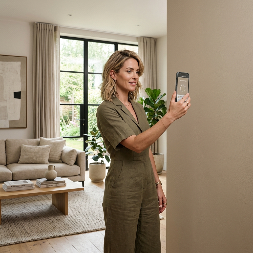
Finding Kids' Room Colors from Inspirational Images with WhtColor
You have seen a children's room photo — on social media, in an architecture magazine, or in a hotel lobby — and the wall color immediately felt right. But you cannot name it, and "something like that blue" is not a brief a paint supplier can work with.
Upload that image to WhtColor, click the color you are responding to, and instantly see its RAL, HEX, and RGB codes. Take those codes to your supplier and reproduce the exact color you saw, without approximation.
This is particularly useful for children's rooms: if your child has a favorite character, a book cover, or a toy in a color they love, you can extract that color precisely and bring it into the room. Make decisions with measurable color codes, not guesswork.
Identify a Kids' Room Color from Any Photo
Upload the image that inspired you, click the color, and instantly see the RAL, HEX, and RGB values. Walk into any paint supplier with the exact code.
Find the RAL Code